Advanced UI Extension Examples
The code that can be added to UI extensions provides nearly endless flexibility. Below are some advanced examples that may come in useful when optimizing the usability of a UI extension.
- Scrollable content
- One checkbox is required
- Minimum and maximum number of checks
- Show field when box is checked
- Show field when boxes are checked
- Show field when option is selected
- Show field when option and checkbox are selected
- Show field when custom collection element is selected
- Access metadata when item is selected
- Add another set of fields
- Telephone number mask
- Retrieving field options from 4me
- Date selection restrictions
- Manipulating date fields
- Manipulating rich text fields
- Hide field on creation of a request in Self Service
- Google maps
Scrollable content
It is possible to include a long list of checkboxes in a UI extension. This can be useful, for example, in a survey. To ensure that the rest of the UI extension does not get pushed down too far, it is possible to place the checkboxes in a scrollable list.
The following UI extension demonstrates a method of neatly packing a long list of checkboxes into a confined space. This is done through the CSS by setting the size of the parent <div> and specifying that any overflow (i.e. contents of the div that fall outside of its bounds) should be scrolled to.
HTML
<div class="scroll-me">
  <div class="row vertical checkbox">
    <input id="1" type="checkbox" value="1">
    <label for="1" title="One">One</label>
  </div>
  <div class="row vertical checkbox">
    <input id="2" type="checkbox" value="2">
    <label for="2" title="Two">Two</label>
  </div>
  <div class="row vertical checkbox">
    <input id="3" type="checkbox" value="3">
    <label for="3" title="Three">Three</label>
  </div>
  <div class="row vertical checkbox">
    <input id="4" type="checkbox" value="4">
    <label for="4" title="Four">Four</label>
  </div>
  <div class="row vertical checkbox">
    <input id="5" type="checkbox" value="5">
    <label for="5" title="Five">Five</label>
  </div>
  <div class="row vertical checkbox">
    <input id="6" type="checkbox" value="6">
    <label for="6" title="Six">Six</label>
  </div>
  <div class="row vertical checkbox">
    <input id="7" type="checkbox" value="7">
    <label for="7" title="Seven">Seven</label>
  </div>
  <div class="row vertical checkbox">
    <input id="8" type="checkbox" value="8">
    <label for="8" title="Eight">Eight</label>
  </div>
  <div class="row vertical checkbox">
    <input id="9" type="checkbox" value="9">
    <label for="9" title="Nine">Nine</label>
  </div>
  <div class="row vertical checkbox">
    <input id="10" type="checkbox" value="10">
    <label for="10" title="Ten">Ten</label>
  </div>
</div>
CSS
.scroll-me {
  height: 95px;
  overflow-y: scroll;
}
.label_checkbox {
  width: 460px;
  overflow-y: hidden;
}
Note that this CSS can be applied to any div that needs to be confined to an area of limited height, e.g. a section with multiple fields or a disclaimer text.
One checkbox is required
The following UI extension uses JavaScript to prevent the user from checking more than one checkbox and requiring a minimum of one checkbox to be checked. This can be useful, for example, in a survey.
HTML
<div class="section" id="laptop_selection"><span class="section-header">Laptop Selection</span>
  <div class="row vertical checkbox">
    <input id="laptop1" type="checkbox" checked>
    <label for="laptop1">Small laptop<br></label>
  </div>

  <div class="row vertical checkbox">
    <input id="laptop2" type="checkbox">
    <label for="laptop2">Medium laptop<br></label>
  </div>

  <div class="row vertical checkbox">
    <input id="laptop3" type="checkbox">
    <label for="laptop3">Large laptop<br></label>
  </div>
</div>
JavaScript
var $ = ITRP.$;            // jQuery
var $extension = $(this);  // The UI extension container with custom HTML

var $checkboxes = $extension.find('#laptop_selection :checkbox');
$checkboxes.on('change', function () {
  var $checkbox = $(this);
  if ($checkbox.is(':checked')) {
    $checkboxes.not('#' + this.id).prop('checked', false);
  } else {
    $checkbox.prop('checked', false);
  }
});

$checkboxes.on('change', function () {
  // Mark as invalid when none of the checkboxes are checked.
  $checkboxes.toggleClass('invalid', !$checkboxes.is(':checked'));
});
This example code results in a list of three checkboxes while only permitting one to be checked. One can add an unlimited number of checkboxes to this design without having to modify the JavaScript.
Minimum and maximum number of checks
This code from the previous example is perfect when only a single box is allowed to be checked. The following UI extension is a modification of the previous example. It allows a minimum and a maximum number of required checks to be specified:
HTML
<div class="section" id="laptop_selection"><span class="section-header">Select Two Peripherals</span>
  <div class="row vertical checkbox">
    <input id="peripheral1" type="checkbox" checked>
    <label for="peripheral1">External Hard Disk<br></label>
  </div>

  <div class="row vertical checkbox">
    <input id="peripheral2" type="checkbox">
    <label for="peripheral2">USB Speakers<br></label>
  </div>

  <div class="row vertical checkbox">
    <input id="peripheral3" type="checkbox">
    <label for="peripheral3">Wireless Headset<br></label>
  </div>
</div>
JavaScript
var $ = ITRP.$;            // jQuery
var $extension = $(this);  // The UI extension container with custom HTML

var minimum = 2;
var maximum = 2;

var $checkboxes = $extension.find('#laptop_selection :checkbox');

if ($checkboxes.filter(':checked').length < minimum) {
  $checkboxes.addClass('invalid');
}

$checkboxes.on('change', function () {
  var $checkbox = $(this);
  if ($checkbox.is(':checked') && $checkboxes.filter(':checked').length > maximum) {
    $checkbox.prop('checked', false);
  }
  if ($checkboxes.filter(':checked').length >= minimum) {
    $checkboxes.removeClass('invalid');
  } else {
    $checkboxes.addClass('invalid');
  }
});
The variables minimum and maximum determine the minimum and maximum number of checkboxes that must be checked by the user.
Show field when box is checked
To make it easier to fill out a form, it is best to initially hide all the sections and fields that may not need to be filled out. When a user selects a specific option, additional fields can be presented to collect the information related to the selected option.
In the UI extension below, an event is triggered when a checkboxes is checked. This then causes an additional input field to appear.
HTML
<div class="row vertical checkbox">
  <input id="email" type="checkbox" class="show-when-empty">
  <label for="email">Email</label>
</div>

<div class="row vertical">
  <label for="email_address">Email address</label>
  <input id="email_address" type="email" autocomplete="on" autocorrect="off" autocapitalize="off" spellcheck="false" class="required">
</div>
JavaScript
var $ = ITRP.$;            // jQuery
var $extension = $(this);  // The UI extension container with custom HTML

var $email = $extension.find('#email');
var $email_address = $extension.find('#email_address');
var $email_address_row = $email_address.closest('.row');

$email.on('change', function() {
  if ($email.is(':checked')) {
    $email_address_row.show();
  } else {
    $email_address_row.hide();
    $email_address.val('').trigger('change');
  }
}).trigger('change');
Show field when boxes are checked
The following UI extension is similar to be previous example, except that it is triggers an event when multiple checkboxes have been checked. In this example an additional input field becomes available for the user when the user has checked 2 specific boxes. This can be useful, for example, in cases where additional information needs to be collected from the user, but only when a specific combination of checkboxes have been checked.
HTML
<div class="row vertical checkbox">
  <input id="send_info" type="checkbox" class="show-when-empty">
  <label for="send_info">Send more information</label>
</div>

<div class="row vertical checkbox">
  <input id="external" type="checkbox">
  <label for="external" title="Person is not an employee">Person is not an employee</label>
</div>

<div class="row vertical">
  <label for="email_address">Email address</label>
  <input id="email_address" type="email" autocomplete="on" autocorrect="off" autocapitalize="off" spellcheck="false" class="required">
</div>
JavaScript
var $ = ITRP.$;            // jQuery
var $extension = $(this);  // The UI extension container with custom HTML

var $email_address = $extension.find('#email_address');
var $email_address_row = $email_address.closest('.row');

$extension.find("#send_info,#external").on('change', function() {
  if ($extension.find("input:checked").length === 2) {
    $email_address_row.show();
  } else {
    $email_address_row.hide();
    $email_address.val('').trigger('change');
  }
}).trigger('change');
The result is that initially only the checkboxes ‘Send more information’ and ‘Person is not an employee’ are visible. When both of these boxes are checked, the input field ‘Email address’ becomes available.
This code can be easily adjusted when more boxes need to be checked before the additional field is revealed. It can also be used when a minimum number of options (e.g. 2 out of 3 checkboxes) need to be checked before revealing the additional field(s).
Show field when option is selected
In some cases it can be useful to show an additional field (or a complete section) when a specific option is selected in a select field. The following UI initially only shows the Category field in which the user can select 4 options. Only when the option ‘Pesticide’ is selected will the EPA number field become available.
HTML
<div class="row vertical">
  <label for="category">Category</label>
  <select id="category" class="required">
    <option value=""></option>
    <option value="detergent">Detergent</option>
    <option value="lubricant">Lubricant</option>
    <option value="pesticide">Pesticide</option>
    <option value="preservative">Preservative</option>
  </select>
</div>

<div class="row vertical">
  <label for="epa">EPA number</label>
  <input id="epa" type="number" autocomplete="off" min="10000" max="100000" step="1" class="required">
</div>
JavaScript
var $ = ITRP.$;            // jQuery
var $extension = $(this);  // The UI extension container with custom HTML

var $category = $extension.find('#category');
var $epa = $extension.find('#epa');
var $epa_row = $epa.closest('.row');

$category.on('change', function() {
  if ($category.val() === 'pesticide') {
    $epa_row.show();
  } else {
    $epa_row.hide();
    $epa.val('').trigger('change');
  }
}).trigger('change');
It is easy to adjust the example above so that the EPA number field gets displayed when either the option ‘Pesticide’ or ‘Preservative’ is selected. The JavaScript would then look as follows:
JavaScript
var $ = ITRP.$;            // jQuery
var $extension = $(this);  // The UI extension container with custom HTML

var $category = $extension.find('#category');
var $epa = $extension.find('#epa');
var $epa_row = $epa.closest('.row');

$category.on('change', function() {
  if (['pesticide', 'preservative'].includes($category.val())) {
    $epa_row.show();
  } else {
    $epa_row.hide();
    $epa.val('').trigger('change');
  }
}).trigger('change');
Show field when option and checkbox are selected
In some cases it can be useful to show an additional field (or a complete section) when a specific option is selected in a select field. The following UI initially only shows the Category field in which the user can select 4 options. Only when the option ‘Pesticide’ is selected will the EPA number field become available.
HTML
<div class="row vertical">
  <label for="category">Category</label>
  <select id="category" class="required">
    <option value=""></option>
    <option value="detergent">Detergent</option>
    <option value="lubricant">Lubricant</option>
    <option value="pesticide">Pesticide</option>
    <option value="preservative">Preservative</option>
  </select>
</div>

<div class="row vertical checkbox">
  <input id="permit" type="checkbox">
  <label for="permit" title="Permit required">Permit required</label>
</div>

<div class="row vertical">
  <label for="epa">EPA number</label>
  <input id="epa" type="number" autocomplete="off" min="10000" max="100000" step="1" class="required">
</div>
JavaScript
var $ = ITRP.$;            // jQuery
var $extension = $(this);  // The UI Extension container with custom HTML

var $category = $extension.find('#category');
var $permit = $extension.find('#permit');
var $epa = $extension.find('#epa');
var $epa_row = $epa.closest('.row');

$category.add($permit).on('change', function() {
  if ($category.val() === 'pesticide' && $permit.is(':checked')) {
    $epa_row.show();
  } else {
    $epa_row.hide();
    $epa.val('').trigger('change');
  }
}).trigger('change');
Show field when custom collection element is selected
In some cases it can be useful to show an additional field when a specific element is selected in a
custom-view-suggest field based on a custom collection. In this example, suppose there is a custom collection named “Colors” with a corresponding custom view. When the user selects “Orange” in the “Color” field, the field “Extra field” appears.
HTML
<div class="row vertical">
  <label for="color" title="Color">Color</label>
  <div id="color" data-custom-view="colors"></div>
</div>

<div class="row vertical">
  <label for="extra_field" title="Extra field">Extra field</label>
  <input id="extra_field" type="text" autocomplete="off">
</div>
JavaScript
var $ = ITRP.$;
var $extension = $(this);

var $color = $extension.find('#color');
var $extra_field = $extension.find('#extra_field');

// Show Extra field when 'orange' is selected in the Color field
$color.on('change', function() {
  var show = $color.data('item').reference === 'orange';
  $extra_field.closest('.row').toggle(show);
}).trigger('change');
Note that the reference of the selected custom collection element is used to determine whether “Extra field” should be visible.
Using the reference, rather than the ID or name of the element, helps to keep the UI Extension maintainable and makes it easier to synchronize the UI Extension between the 4me QA and Production environments.
Here is a second example, where “Extra field” should appear if “Orange” is one of the selected values in the multi-suggest field “Colors”.
HTML
<div class="row vertical">
  <label for="colors" title="Colors">Colors</label>
  <div id="colors" data-multiple data-custom-view="colors"></div>
</div>

<div class="row vertical hide">
  <label for="extra_field" title="Extra field">Extra field</label>
  <input id="extra_field" type="text" autocomplete="off">
</div>
JavaScript
var $ = ITRP.$;
var $extension = $(this);

var $colors = $extension.find('#colors');
var $extra_field = $extension.find('#extra_field');

// Show Extra field when 'orange' is one of the selected values in the Colors field
$colors.on('change', function() {
  var is_orange = function(item) { return item.reference === 'orange'; };
  var show = $colors.data('items').filter(is_orange).length > 0;
  $extra_field.closest('.row').toggle(show);
}).trigger('change');
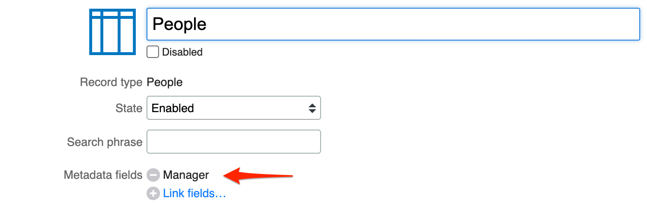
Access metadata when item is selected
The UI Extension Javascript API
describes how to access attributes of an item selected in a custom-suggest field via Metadata fields of a custom view.
Here is an example. Suppose there is a custom view named “People”. You want to create a UI Extension with a “Person” and a “Manager” field, both based on the “People” custom view. The “Manager” field is read-only. When the user selects a value in the “Person” field, the “Manager” field should automatically be filled with the manager of the person.
First edit the custom view and add “Manager” to the metadata fields:
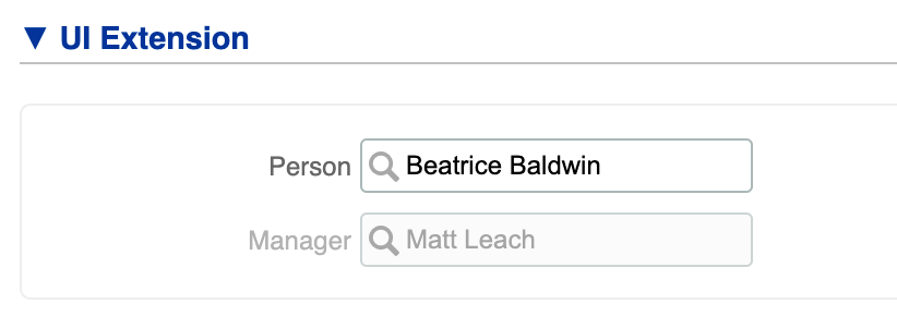
Now create the UI Extension as follows:
HTML
<div class="row vertical">
  <label for="person" title="Person">Person</label>
  <div id="person" data-custom-view="people"></div>
</div>

<div class="row vertical hide">
  <label for="manager" title="Manager">Manager</label>
  <div id="manager" data-custom-view="people"></div>
</div>
JavaScript
var $ = ITRP.$;
var $extension = $(this);

var $person = $extension.find('#person');
var $manager = $extension.find('#manager');
$manager.readonly(true);

$person.on('change', function() {
  var manager = $person.data('item').manager;

  // Set the 'Manager' field to the manager of the selected person.
  $manager.val(manager != null ? manager.id : '');

  // Hide the row if there is no manager
  $manager.closest('.row').toggleClass('hide', manager == null);
});
The result looks like this:
Add another set of fields
The following example initially shows one set of input fields. A user can add another set of the same input fields when that is needed. In this example, a user is able to add up to three sets of the same input field. This limit can be modified simply by adding more sections with those same fields.
This can be useful, for example, when users needs to be able to register one or more people for a training.
HTML
<div class="section" id="section1">
  <span class="section-header">Guest 1</span>

  <div class="row vertical">
    <label for="name1">Full name</label>
    <input id="name1" type="text" autocomplete="off" class="required">
  </div>

  <div class="row vertical">
    <label for="date1">Date</label>
    <input id="date1" type="text" autocomplete="off" class="required date">
  </div>

  <div class="row vertical checkbox">
    <input id="password1" type="checkbox">
    <label for="password1">WiFi password required</label>
  </div>
  <a class="hide-order" href="#">Hide</a>
</div>

<div class="section hidden-section" id="section2">
  <span class="section-header">Guest 2</span>

  <div class="row vertical">
    <label for="name2">Full name</label>
    <input id="name2" type="text" autocomplete="off" class="required">
  </div>

  <div class="row vertical">
    <label for="date2">Date</label>
    <input id="date2" type="text" autocomplete="off" class="required date">
  </div>

  <div class="row vertical checkbox">
    <input id="password2" type="checkbox">
    <label for="password2">WiFi password required</label>
  </div>
  <a class="hide-order" href="#">Hide</a>
</div>

<div class="section hidden-section" id="section3">
  <span class="section-header">Guest 3</span>

  <div class="row vertical">
    <label for="name3">Full name</label>
    <input id="name3" type="text" autocomplete="off" class="required">
  </div>

  <div class="row vertical">
    <label for="date3">Date</label>
    <input id="date3" type="text" autocomplete="off" class="required date">
  </div>

  <div class="row vertical checkbox">
    <input id="password3" type="checkbox">
    <label for="password3">WiFi password required</label>
  </div>
  <a class="hide-order" href="#">Hide</a>
</div>

<a id="add-order" href="#">Add another</a>
JavaScript
var $ = ITRP.$;            // jQuery
var $extension = $(this);  // The UI extension container with custom HTML

var $sections = $extension.find('.section');
var $addOrder = $extension.find('#add-order');

ITRP.hooks.register('after-prefill', function() {
  $sections.find('.hidden-section').each(function() {
    var $section = $(this);
    if (ITRP.hasFormData($section)) {
      $section.removeClass('hidden-section');
    }
  });
});

$addOrder.on('click', function(event) {
  event.preventDefault();
  var $hiddenSections = $sections.find('.hidden-section');
  if ($hiddenSections.length === 1) {
    // Last one left, hide the add-order option.
    $(this).hide();
  }
  $hiddenSections.first().removeClass('hidden-section');
});

$('a.hide-order').on('click', function(event) {
  event.preventDefault();
  var $section = $(this).parent('.section');

  // Hide section + clear form data
  $section.addClass('hidden-section');
  ITRP.clearFormData($section);

  // More sections available, show the add-order option.
  if ($sections.find('.hidden-section').length > 0) {
    $addOrder.show();
  }

});
CSS
.hidden-section { display: none; }
Telephone number mask
This UI extension uses JavaScript to transform a 10 digit telephone number taken from a normal text input field into one that accepts phone numbers in the format (XXX)-XXX-XXXX only. This can help users avoid mistakes when entering a telephone number without having to worry about they formatting. This example can be used to prepare similar masks for, for example, zip codes.
HTML
<div class="row horizontal">
  <label for="phone-number" title="Telephone">Telephone</label>
  <input id="phone-number" name="phone-number" type="text" maxlength="14" placeholder="(XXX) XXX-XXXX" autocomplete="off">
</div>
JavaScript
var $ = ITRP.$;            // jQuery
var $extension = $(this);  // The UI extension container with custom HTML

var $phone = $extension.find('#phone-number');

$phone.on('keydown', function (e) {
  var key = e.key;

  // Auto-format- do not expose the mask as the user begins to type
  if (!['Backspace', 'Tab'].includes(key)) {
    if ($phone.val().length === 4) {
      $phone.val($phone.val() + ')');
    }
    if ($phone.val().length === 5) {
      $phone.val($phone.val() + ' ');
    }
    if ($phone.val().length === 9) {
      $phone.val($phone.val() + '-');
    }
  }

  // Allow numeric (and tab, backspace, delete) keys only
  var isNumeric = ['0', '1', '2', '3', '4', '5', '6', '7', '8', '9'].includes(key);
  var isControlChar = ['Backspace', 'Tab', 'Delete'].includes(key);
  return isNumeric || isControlChar;
});

$phone.on('focus click', function () {
  if ($phone.val().length === 0) {
    $phone.val('(');
  } else {
    var val = $phone.val();
    $phone.val('').val(val); // Ensure cursor remains at the end
  }
});

$phone.on('blur', function () {
  if ($phone.val() === '(') {
    $phone.val('');
  }
});
Retrieving field options from 4me
The UI extension below retrieves data from 4me that is used to populate the list of options for two select fields. One field allows a user to select a person, the other allows a configuration item (CI) to be selected.
The JavaScript in this example looks up all the people from the organization
that has the ID=52 (which is Widget Data Center, Internal IT) and lists the
names of these people as options in the Person select field. The JavaScript also
looks up all CIs that are linked to a service instance for which the current
user is covered by an active SLA. For the CIs the option nameFilter is set to
CIs that contain the word ‘printer’ in their name. Note that the filter is
applied on the client after the CIs have been retrieved from the server.
This example makes use of the access rights of the user, so there are no security issues.
HTML
<div class="row vertical">
  <label for="person" title="Person">Person</label>
  <select id="person">
    <option value=""></option>
  </select>
</div>

<div class="row vertical">
  <label for="ci" title="CI">CI</label>
  <select id="ci">
    <option value=""></option>
  </select>
</div>
JavaScript
var $ = ITRP.$;            // jQuery
var $extension = $(this);  // The UI extension container with custom HTML

var fillSelect = function($select, url, includeBlank, nameFilter, account) {
  var updateSelect = function(json) {
    var options = includeBlank ? '<option value=""></option>' : '';
    for (var i = 0; i < json.length; i++) {
      if (!nameFilter || nameFilter.test(json[i].name)) {
        options += '<option value="' + json[i].id + '">' + Html.encode(json[i].name) + '</option>';
      }
    }
    $select.html(options);
  };

  var data = {
    url:      url,
    type:     'GET',
    dataType: 'json',
    success:  updateSelect
  };
  if (account) {
    data.headers = {'X-4me-Account':account};
  }
  $.ajax(data);
};
// fill Person dropdown using Internal Organization 'Widget Data Center, Internal IT'
fillSelect($extension.find('#person'), '/v1/people?organization_id=52&per_page=100', false, null, 'widget');

// fill CI dropdown using name filter on 'printer' (case insensitive)
fillSelect($extension.find('#ci'), '/v1/me/ci_coverages?per_page=100', true, /printer/i);
Date selection restrictions
The following HTML creates an input field that allows a user to select a date.
HTML
<div class="row vertical">
  <label for="start" title="Start">Start</label>
  <input id="start" type="text" autocomplete="off" class=" date">
</div>
There are numerous ways that JavaScript can be added to restrict the dates that a user can select in this date field. A few examples are provided below.
If a user should not be allowed to select a date that is more than 2 days before the creation date of the record, this minimum limit can be defined using JavaScript as follows:
JavaScript
var $ = ITRP.$;            // jQuery
var $extension = $(this);  // The UI extension container with custom HTML

ITRP.hooks.register('after-prefill', function() {
  var minDate = ITRP.record.initialValues.created_at ? new Date(ITRP.record.initialValues.created_at) : new Date();
  minDate.setDate(minDate.getDate() - 2);
  $extension.find('#start')
    .dateEntry('change', { minDate: minDate })
    .datepick('option', { minDate: minDate });
});
Alternatively, if a user should not be allowed to select a date that is more than 2 days ago (regardless of the record’s creation date), this minimum limit can be defined using JavaScript as follows:
JavaScript
var $ = ITRP.$;            // jQuery
var $extension = $(this);  // The UI extension container with custom HTML

ITRP.hooks.register('after-prefill', function() {
  $extension.find('#start')
    .dateEntry('change', { minDate: '-2d' })
    .datepick('option', { minDate: '-2d' });
});
If the maximum date value is 3 weeks from now, this JavaScript can be used:
JavaScript
var $ = ITRP.$;            // jQuery
var $extension = $(this);  // The UI extension container with custom HTML

ITRP.hooks.register('after-prefill', function() {
  $extension.find('#start')
    .dateEntry('change', { maxDate: '+3w' })
    .datepick('option', { maxDate: '+3w' });
});
In order to add a minimum and a maximum, one can combine the previous JavaScript examples into the following:
JavaScript
var $ = ITRP.$;            // jQuery
var $extension = $(this);  // The UI extension container with custom HTML

ITRP.hooks.register('after-prefill', function() {
  $extension.find('#start')
    .dateEntry('change', { minDate: '-2d', maxDate: '-2d +3w' })
    .datepick('option', { minDate: '-2d', maxDate: '-2d +3w' });
});
If users should only be allowed to select weekdays, the following JavaScript can be included in the UI extension:
JavaScript
var $ = ITRP.$;            // jQuery
var $extension = $(this);  // The UI extension container with custom HTML

ITRP.hooks.register('after-prefill', function() {
  $extension.find('#start').datepick('option', { onDate: $.datepick.noWeekends });
});
If users should only be allowed to select the first of the month, the following JavaScript can be included in the UI extension:
JavaScript
var $ = ITRP.$;            // jQuery
var $extension = $(this);  // The UI extension container with custom HTML

ITRP.hooks.register('after-prefill', function() {
  $extension.find('#start').datepick('option', {
    onDate: function(date, inMonth) {
      return { selectable: inMonth && date.getDate() == 1 };
    }
  });
});
Manipulating date fields
The following HTML creates an input field that allows a user to select a date.
HTML
<div class="row vertical">
  <label for="start" title="Start">Start</label>
  <input id="start" type="text" autocomplete="off" class=" date">
</div>
The example below shows how to retrieve the date value and how to change the date value using javascript.
JavaScript
var $ = ITRP.$;            // jQuery
var $extension = $(this);  // The UI extension container with custom HTML

// set start to today if empty
ITRP.hooks.register('after-prefill', function() {
  var $start = $extension.find('#start');
  var startDate = $start.dateEntry('getDate');
  if (!startDate) {
    $start.dateEntry('setDate', new Date());
  }
});
Manipulating rich text fields
The following HTML creates an rich text field.
HTML
<div class="row">
  <label for="rich_text_field" title="Rich Text">Rich Text</label>
  <div id="rich_text_field" class="rich-text"></div>
</div>
The value of this field can be read or changed in several ways.
To get the current value of the field, use the snippet below. Note that this returns the value in Markdown format, which is documented here.
JavaScript
var value = $extension.find('#rich_text_field').val();
To clear the field, use the following snippet:
JavaScript
$extension.find('#rich_text_field').val('');
The field value can be set in two ways, as shown in the following snippet:
JavaScript
// To set plain text:
$extension.find('#rich_text_field').val('New value');

// To set HTML:
$extension.find('#rich_text_field').val({ html: 'This is <b>bold</b> text.' });
The value of the standard Note field can also be manipulated using the val() function.
Access the Note field via the UI Extension Javascript API, as illustrated below:
JavaScript
var value = ITRP.field('note').val();
ITRP.field('note').val('');
ITRP.field('note').val('New value');
ITRP.field('note').val({ html: 'This is <b>bold</b> text.' });
Hide field on creation of a request in Self Service
Given a UI Extension with the following HTML:
HTML
<div class="row vertical">
  <label for="phone-number" title="Phone number">Phone number</label>
  <input id="phone-number" type="text" autocomplete="off">
</div>
To hide this field when the user is creating a request in Self Service, use the following snippet:
JavaScript
var $phone_number = $extension.find('#phone-number');
var self_service = ITRP.context === 'self_service';
var new_record = ITRP.record.new;
$phone_number.closest('.row')
  .toggleClass('hide', self_service && new_record);
Google maps
The following HTML creates a select field that allows a user to select a site. A map is then shown with the location of the selected site.
HTML
<div class="row vertical">
  <label for="site" title="Site">Site</label>
  <select id="site" class="required">
    <option value=""></option>
    <option value="21">Boston - Widget Research and Development Center</option>
    <option value="20">Chicago - Widget Manufacturing Center</option>
    <option value="17">Houston - Widget Data Center</option>
    <option value="19">New York - Widget International Headquarters</option>
  </select>
</div>
<div id="map_row" class="row vertical">
  <label for="map" title="Google Maps">Map</label>
  <div id="map" class="google-maps" data-zoom="15"></div>
</div>
To show the correct location on the map, use the following javascript:
JavaScript
var $ = ITRP.$;            // jQuery
var $extension = $(this);  // The UI extension container with custom HTML

var $site = $extension.find('#site');
var $map = $extension.find('#map');
var $map_row = $map.closest('.row');

// Set the map to read-only
$map.readonly(true);

// Display the selected site in Google Maps
$site.on('change', function() {
  if ($site.val() === '') {
    $map_row.hide();
  } else if ($site.val() === '21') {  // Boston
    $map_row.show();
    $map.val('42.35635590627863,-71.05467369039637');
  } else if ($site.val() === '20') {  // Chicago
    $map_row.show();
    $map.val('41.80014278212175,-87.58900170760779');
  } else if ($site.val() === '19') {  // New York
    $map_row.show();
    $map.val('40.78465581754781,-73.95433407140071');
  } else if ($site.val() === '17') {  // Houston
    $map_row.show();
    $map.val('29.74757352449744,-95.45033247355043');
  }
}).trigger('change');
Remark: to use the Google Maps functionality, the Google Maps app that can be found in the 4me app store of the 4me account needs to be installed. In the 4me demo environment, the API key field can be left empty.